
An App Screenshot Generator That Keeps Client Work Moving
A practical guide for agencies choosing an app screenshot generator that keeps client work organized, flexible, and ready to present.
The first screenshot request in an agency project nearly always sounds manageable.
There is an app, a launch date, a logo folder, and a line in the brief that says something close to making the store listing look premium. Then a second client needs a different device family. Someone has new onboarding screens. Another stakeholder asks for a version that works in two languages. The files multiply quietly, and suddenly the work is not only about making a lovely image.
It is about keeping several moving product stories clear at the same time.
That is why I think an app screenshot generator deserves to be chosen as a working space, not as a one-off export machine. Agencies need somewhere they can bring in real app screens, shape a visual direction, make the inevitable revisions, and return to a project without reopening a maze of old artboards. The useful question is not just whether a tool can make a phone mockup. It is whether it helps the next client project feel as calm as the first.
AppScreenshoot is made for that kind of work. Its browser-based editor brings screenshots, copy, device treatments, and store-ready composition into one place. A team can start with an editable template, build the gallery in the editor, and keep the source ready when a client comes back with the very normal request for one more change.
That last part is where the good feeling lives. The client sees a polished gallery. The agency gets a workflow that can keep up with real project life.
01 Choose a generator that lets every client keep their own visual voice
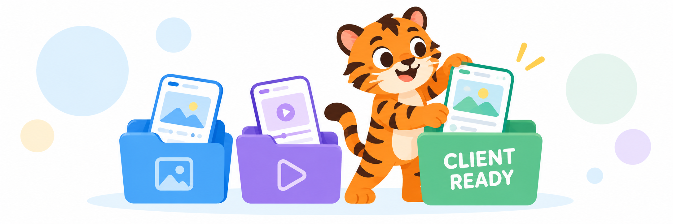
Agency work has a particular visual trap. Once a system works, it is tempting to use it everywhere.
There is nothing wrong with having a reliable rhythm. A clear headline, a well-framed product screen, and a background with enough room to breathe are good building blocks. The problem appears when that rhythm hardens into a costume. A budgeting app, a meditation app, and a fast-moving social product should not all arrive in the store wearing the same jacket just because the agency had a successful launch last month.
A capable screenshot generator gives you a fast starting point without deciding the finished look for you. Templates should be editable, not precious. The headline needs to move when the product screen is stronger than the copy. The screen needs more space when the interface itself is the proof. A visual treatment can become quieter when a client already has a distinctive brand world worth letting through.
That is a much better relationship with a template. It saves the blank-canvas anxiety, then gets out of the way.
In AppScreenshoot, an agency can open an editable template, replace the example material with the real product, and tune the composition inside the same project. Captions, backgrounds, device presentation, and the screen itself can be shaped together. That keeps the conversation close to the product rather than turning the design into a pile of disconnected layers.
I like to make one small decision before a client gallery starts. What should a visitor notice first? For a habit app, it might be the calm daily screen that makes the promise believable. For a creator tool, it may be the finished result, bright and unmistakable. For a travel app, a sense of the trip coming together can carry the opening slide. That answer gives the layout a center of gravity.
From there, the visual choices become much less mysterious. The headline supports the first impression. The device treatment gives the interface a clear home. The background creates contrast without demanding attention for itself. Every part has a job, which is how a gallery avoids becoming a row of very expensive wallpaper.
An editor that keeps these choices open also makes client feedback less theatrical. Instead of hearing that the design feels wrong, you can look together at the slide and ask what is missing. Does the product screen need to be larger? Is the promise too broad? Has the background begun to compete with the feature? Those are practical questions, and they lead to practical changes.
The client still gets a distinct visual story. The agency gets a repeatable way to help that story appear.
That balance is worth looking for when you compare generators. Consistency is useful. Sameness is not. The right workflow keeps the reliable parts of your process while leaving enough room for each app to look like itself.
02 Keep the whole store gallery visible while the project changes
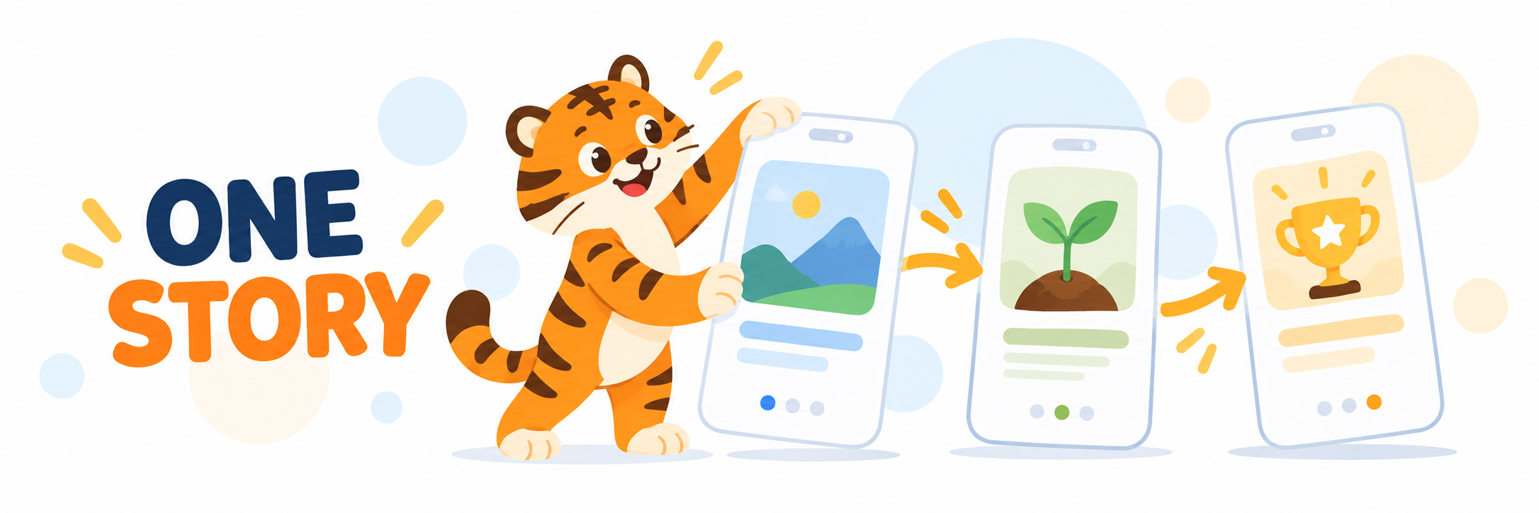
The client rarely experiences a screenshot as a single image.
They experience a gallery as a quick introduction. One slide catches the eye. The next makes the main action feel understandable. Another gives the visitor a reason to trust that the app will still be useful after the first tap. It is a tiny narrative, and it is surprisingly easy to lose when an agency is deep in revision mode.
One client approves a new hero screen. Another asks to make a benefit statement warmer. A product team notices that the most impressive interaction is buried on slide four. None of these requests is unusual. The hard part is remembering what each revision does to the sequence around it.
That is why an agency-friendly generator needs to make the full gallery easy to see and revisit. A layout can be beautiful in isolation and still be the wrong second act. The same screen can feel perfect on slide three but too detailed to carry the first impression. Keeping the set together helps the team make decisions in the right context.
AppScreenshoot treats the gallery as connected work inside its editor. You can work through the screens as a set, use templates as an adaptable visual base, and keep each real product capture tied to the message it supports. When a client request arrives, the project stays legible enough to answer it without guessing where the story has gone.
There is a review habit I return to for this. Read every slide in order and give it one plain sentence. The first welcomes. The second demonstrates. The third deepens the value. If two slides are doing the same work, one of them has space to become more useful. If a slide cannot be described without a long explanation, the visitor may need a clearer signal too.
Take a client with a scheduling app. The opening screen might give people the relief of seeing a week become manageable. The second can show the action that makes planning quick. The third might make collaboration feel simple rather than technical. None of those images needs to explain every feature. Together, they make the product feel familiar.
The same thinking holds when the details change. If the client brings a better screen, move it into the narrative deliberately. If the local copy needs more room, let the surrounding slides keep their pace. If a visual direction becomes bolder, make sure the app interface remains the hero. The gallery is strong because the images support one another, not because they happen to share a color.
This is where browser-based editing is quietly helpful for client work. You can reopen a project, see the sequence again, and make one considered adjustment while the full set remains close at hand. The revision does not have to start with a scavenger hunt for an old source file. It can start with the question that matters, what should the next visitor understand?
For an agency, that clarity is a service in its own right. Clients may remember the finished screens, but they also remember whether the work felt orderly when the launch date started getting close.
03 Make revisions and handoffs feel like part of the craft
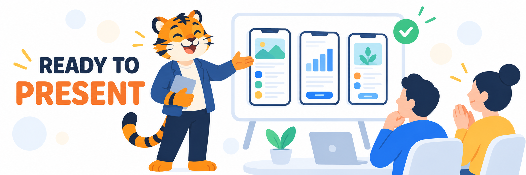
There is a point in every client project when the words final and small change begin appearing in the same message.
This is not a crisis. It is just what polished work looks like near the finish line. The product team has seen the gallery next to a new build. A marketer has found a cleaner phrase. Someone notices the app screen that deserves the opening position. The work is becoming more specific, which is usually a very good sign.
The generator you choose decides whether those moments feel like care or like friction. When the working source is editable and the project is easy to reopen, a revision can be a normal design decision. When the source has dissolved into flattened exports and mystery folders, one line of copy can feel far larger than it is.
AppScreenshoot keeps a project in the browser-based editor where the composition was made. Agencies can return to the real screens, captions, device treatments, and backgrounds instead of trying to reconstruct an earlier version from a PNG. Start from a template or a blank canvas, keep the store gallery together, and refine the work until the version on screen is the version you want a client to present.
That is especially useful when different people need to look at the same set. A designer can protect the visual hierarchy. A product teammate can check whether the captured screen tells the truth about the experience. A marketing lead can make sure the first promise is easy to understand. The discussion stays grounded because everyone is looking at the gallery, not trying to remember what it looked like before a late-night export.
The handoff becomes clearer too. A gallery that has been reviewed as a sequence is already organized around its purpose. The next person can see the intended story rather than receiving a folder of unrelated images with names that have become a little too creative. The work feels ready because it has been treated as a complete introduction from the start.
I think that is the real value for agencies. A dedicated generator is not there to make creative work automatic. It gives good judgment a practical home. It lets the team move quickly without rushing the decisions that a visitor will actually feel.
So when you compare app screenshot generators, look beyond the first handsome template. Choose one that lets each client have a distinct voice, keeps the gallery visible as a story, and leaves room for the revisions that make a launch stronger. AppScreenshoot gives agencies an inviting place to do exactly that, from the first client draft to the store gallery ready to share.
The project can keep moving. The app can keep looking like itself.