
App Screenshot Preview for Every Store Size
A practical way to preview App Store and Google Play screenshots at every target size, keep the story readable, and export a gallery with confidence.
The screenshot looked lovely at 200 percent zoom.
It had a soft background, a sentence everyone liked, and a perfectly placed phone frame. Then somebody dropped it into a narrow store preview during a launch review. The sentence became a grey little ribbon. The interface, which was supposed to do the convincing, turned into a postage stamp. The design was still technically correct. It had simply stopped doing its job.
That is the quiet reason an app screenshot preview matters. Store listing images are never experienced at the comfortable size where they are usually made. They show up in a search result, on a phone in one hand, inside a gallery beside competing apps, and across the device classes a team supports. A composition needs to keep its idea when the canvas changes and when the viewer is moving quickly.
I do not think this calls for a grand process. It calls for looking at the real thing early, then looking again when the layout changes. The work gets much calmer when the preview is part of the design room rather than a last-minute checkpoint after every layer has become precious.
That is a lovely fit for AppScreenshoot. Its browser-based editor brings the screen, headline, device treatment, and store-focused canvas into one editable project. You can open an AppScreenshoot template, put a real product screen where it belongs, preview the direction as you shape it, and export the final set once the story still feels clear at the sizes that matter.
The goal is wonderfully simple. Someone should be able to glance at the listing and understand why they might want the app.
01 Look at the thumbnail before you fall in love with the layout

Most screenshot layouts have a moment when they are flattering you.
It happens on the big monitor. You can see the careful corner radius, the tiny line of supporting copy, the screenshot inside the screenshot, and every decorative shape doing its modest little dance. There is nothing wrong with enjoying that view. I enjoy it too. But a person discovering an app rarely gives a store gallery that kind of attention at the beginning.
They see the small version first. The title needs to land. The main product moment needs to register. The difference between a helpful interface and a busy one has to be visible without a guided tour.
That is why I like to preview the opening image at a smaller scale before I make any final decision. Not to punish the design. To ask it a friendly question. Can I tell what is happening here in a couple of seconds?
If the answer is a little fuzzy, the most useful fix is often surprisingly gentle. Give the screen more room. Remove one supporting phrase. Let the headline make one promise instead of two. Move a decorative detail behind the product rather than beside it. The image does not need more energy. It needs one obvious place for the eye to land.
An opening screenshot for a finance app might show the moment a person understands their month. A habit app might make the finished streak the hero. A photo tool might lead with the before-and-after result that people came to find. The exact feature changes. The test does not. A small preview should still let the main outcome say hello.
I have always found this reassuring because it gives creative teams a more useful standard than making every slide feel impressive in isolation. A clean first image is not the one with the most visual ingredients. It is the one that keeps its point after the listing shrinks it down.
In the AppScreenshoot editor, that check can happen while the pieces are still movable. Adjust the device scale, edit the caption, try a calmer background, or swap to a screen that carries the action more naturally. The project stays open to a better decision instead of asking the team to defend the first polished export.
There is a small psychological benefit here too. When a design has passed the tiny-preview test, it feels less fragile. You know the hierarchy is doing real work. You can carry that confidence into the next slides instead of hoping a good-looking desktop file will explain itself elsewhere.
The thumbnail is not a lesser version of the composition. It is the first conversation with a future customer. Give it a clear first sentence.
02 Let the composition change its posture with the canvas
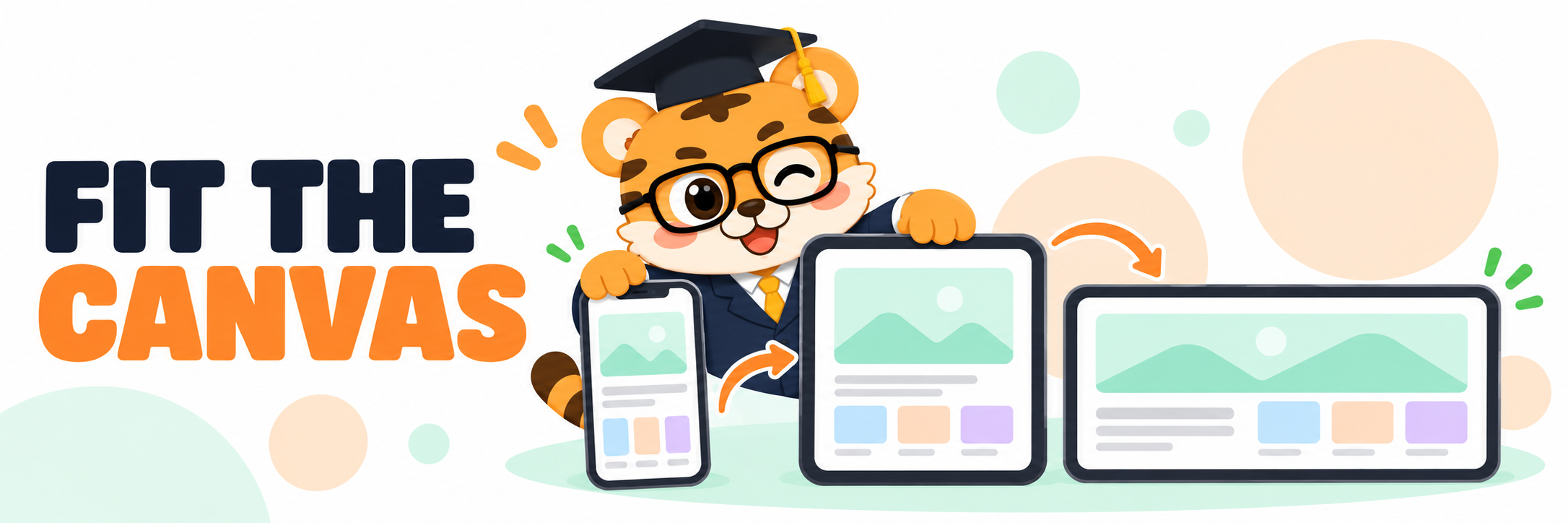
There is a very human impulse to make one beautiful image and ask it to travel everywhere.
I get it. You have found a headline position that feels just right. The phone frame has a nice amount of air around it. The background has finally stopped competing with the interface. Duplicating that composition into another device target sounds sensible.
The problem is not the shared visual direction. That part is exactly what makes a store set feel like it belongs together. The problem arrives when a different canvas is treated like a photocopier setting. A taller frame can make the title feel cramped. A wider card can strand the product in empty space. A tablet layout can reveal that the interface was only readable because the phone crop was doing a great deal of generous editing.
A good preview gives each target a chance to stand up straight.
This is where a flexible screenshot maker becomes much more pleasant than a stack of flattened files. You can preserve the parts people recognize, the type style, the background family, the device treatment, the overall pace, while letting the screen and copy take the room they need. The concept remains the same. Its posture changes.
Think about a reading app. On a phone image, the frame might be large and vertical, with a short line of copy over generous blank space. On a tablet target, the reading interface may deserve a wider crop so a visitor can see the layout that makes the product special. Forcing the phone scene into that wider space can make both versions feel a little apologetic. Letting each one breathe makes the shared direction feel intentional.
This does not have to turn into a separate design project for every size. Start by protecting a small visual system. Keep the headline character. Keep the color family. Keep the device language. Then make the local adjustments that help the message survive. Enlarge a compact screen. Shift a caption. Rebalance the space around a landscape view. Make one decision at a time, with the actual target in front of you.
AppScreenshoot is built for that kind of working rhythm. Templates are editable compositions rather than locked preview images, so a team can use a direction as a real starting point. Open a layout from the template library, bring in the product screens, and tune the composition around the canvases that will carry the listing.
There is something satisfying about seeing the family resemblance stay intact while each image becomes more comfortable in its own frame. The user does not notice the craft in those words. They just feel that the gallery is clear, considered, and easy to trust.
That is the part worth keeping. Consistency should make the app easier to recognize. Flexibility should make it easier to understand.
03 Review the gallery as a small story, not a folder of exports

By the time a team has five or six screenshot images, it is easy to lose the thread.
Every individual card may have a reason for existing. One introduces the promise. One shows a workflow. One reveals a useful detail. One adds a satisfying result. Yet the gallery can still feel oddly repetitive when it is seen all at once. Two slides might be asking the same question. A lovely visual treatment can quietly make a later screen harder to read. A strong third image can arrive too late, after the visitor has already decided they understand the app.
The strip view has a way of telling the truth.
I like to look at the full sequence as if I have never met the product. Does the first image make a useful promise? Does the next image give it proof? Is each later screen adding a fresh reason to care? When the answer is yes, the gallery has momentum. It feels less like a collection of marketing assets and more like a short introduction made by people who know what is genuinely good about the app.
This is also the moment to preview the boringly important details with a little affection. Look at the smallest text. Look at the real screen, not only the device outline around it. Make sure the visual emphasis moves from slide to slide rather than repeating one pose. The final review is not there to make anybody nervous. It is there to help the best parts of the product get a fair chance to be seen.
An editable workflow changes the tone of this review. If the second and fourth slides are doing the same job, you can move the stronger proof forward. If the final caption needs less poetry and more clarity, the words are right there. If a dense interface wants a more generous crop, the composition can welcome it. You are still making the gallery, not merely checking files after the creative work has ended.
AppScreenshoot keeps those choices together in one studio. You can begin with a blank canvas or an editable template, arrange the real screens as a sequence, refine the copy and device treatments, then export PNG, JPEG, or ZIP files when the set is ready to join the rest of launch work. It is a warm, practical way to keep the screenshot story in motion.
I think that is what people are really looking for when they search for an app screenshot preview tool. Not another place to add decoration. A place to see the app from the visitor's side before the listing goes live.
The big monitor will always make a screenshot look a little magical. That is fine. Just give the small preview, the second device class, and the full gallery strip their turn at the table. They will tell you whether the magic still has a message.
Start your next store gallery with AppScreenshoot, and give every screen a clear, confident place to be seen.