
App Store Screenshot Mockup Tools That Let Your Product Lead
Learn how to choose an App Store screenshot mockup tool that keeps real product screens, device presentation, brand choices, and your full gallery working together.
The folder was called screenshots-final-final-really.
I wish I were joking. Inside it were six polished images, three nearly identical device frames, two background colors that had drifted apart somewhere between Tuesday and Thursday, and one very good product screen sitting in the fifth position where almost nobody would meet it first.
Nothing in that folder was ugly. That was the slightly painful part. Every individual image had been made with care. Together, though, they felt like six people had dressed for the same dinner without talking to one another.
That is the question worth carrying into a search for an App Store screenshot mockup tool. Not, can this put a phone inside a pretty background? Almost anything can do that. The more useful question is whether the tool gives a real app a coherent way to introduce itself.
An App Store gallery has a wonderfully small amount of space to do a big job. A person should be able to see the opening promise, recognize the product, and feel a reason to keep swiping. The mockup is there to help that conversation happen. It should make the interface easier to trust, not become the loudest thing in the room.
AppScreenshoot is made for that particular kind of work. It is a browser-based studio where real product screens, editable templates, device treatments, store-focused canvases, and practical exports live together. You can begin with the template collection, shape the composition in the editor, and turn a first visual idea into a connected gallery without leaving the creative flow.
I have found that three questions reveal far more than a long feature table. They are not glamorous questions. They are the ones that keep the good screen from ending up in position five.
01 Can the mockup make your real product feel immediate?

A mockup begins with a strange temptation. You open a tool, see a beautifully lit phone frame, a glossy shadow, a friendly color field, and suddenly the decorative part feels like the project. It is very easy to spend twenty minutes adjusting the mood of the background while the actual app is still a tiny rectangle in the middle.
I get it. A good frame is satisfying. It gives a raw capture some posture. It tells the eye where to look. It can make a product screen feel like an object somebody would like to pick up and use.
But the screen has to remain the proof.
Picture a meal-planning app. The promising image is not a generic phone leaning against a perfect sphere. It is the moment when a person can see a week becoming manageable, perhaps recipes grouped by day and a shopping list that finally looks calm. The mockup earns its place when it brings that moment forward. If the device treatment hides the useful details, the composition has become very fashionable camouflage.
So the first thing I would test is delightfully ordinary. Add one real screen. Put it into a frame. Make it large enough to read at a glance. Move the frame a little. Change the background. Then ask whether the reason to install the app arrives faster or slower than it did before.
A strong App Store screenshot mockup tool makes this test feel light. You should be able to place the actual product at the center, choose a device presentation that supports it, and make room for a short message without turning the screen into a stamp. The tool is working when you can make a confident visual decision, then immediately see whether the interface still carries the claim.
AppScreenshoot keeps that relationship direct. Start from an editable template or a fresh canvas, bring in the screens that genuinely show the product at work, then adjust the device treatment, copy, and composition around them. The mockup becomes a frame for a real experience rather than a substitute for one.
This is especially useful when the app itself has a strong visual personality. A soft wellness product may want an airy frame and quiet room around its screen. A finance product may want a more structured composition that makes data easy to take in. A playful photo app can carry a brighter gesture. The point is not to force every product into one aesthetic. The point is to give the product enough presence that its own personality has somewhere to show up.
There is a very practical test here. Shrink the artwork in your mind until it is closer to a store preview. Can a person still tell what the app helps them do? If the answer is yes, the mockup is serving the screen. If the answer is no, the phone may be beautifully dressed for the wrong occasion.
That modest bit of restraint is what makes an opening image feel generous. It lets the visitor meet the app first.
02 Does the tool help a gallery look like one idea?

The second screenshot is where many galleries lose the thread.
The first one is often easy. Everyone has energy for the opening promise. By the third or fourth image, though, the process can become a quiet scavenger hunt. Find another screen. Find another background. Find a new way to make it feel fresh. Before long, the gallery is technically varied but emotionally scattered.
The better goal is not sameness. It is recognition.
You want someone to feel that every slide came from the same product world even while each one gives them a new reason to care. The opening can make a clear promise. The next image can show the central action. A later image can make the product feel personal, calm, fast, or surprisingly simple. Each card has its own job. The visual voice stays familiar enough that the story can keep moving.
This is why I care about a mockup tool as a workspace, not just a place to export isolated files. The useful moment is being able to look at the full sequence and notice that the third image feels like it belongs to a different campaign. Maybe the frame is suddenly more dramatic. Maybe the headline is doing the same job as slide one. Maybe the most convincing product screen has accidentally been buried at the end.
When the set is visible together, those things announce themselves. You do not need a grand design theory. You can simply notice that the story is wandering, then guide it back.
With AppScreenshoot, templates provide a connected visual starting point, while the editor lets the actual screens, captions, backgrounds, and device treatments stay editable as a group. That makes it comfortable to carry one visual rhythm through the gallery while giving every screenshot its own point of view.
Take a travel-planning app. The first slide might show a clear trip overview with a line about keeping every plan in one place. The second can show the shared itinerary that makes the promise believable. The third can zoom in on the practical detail, perhaps tickets or addresses that are easy to find on the day. Those are three different moments. They do not need three unrelated art directions.
The same idea works for a focused productivity app. Start with the calmer day a person wants. Follow with the quick action that makes it possible. Let a later screen show the gentle progress that keeps the habit going. The product does not need to shout six different benefits at once. It needs to let each screenshot hand the viewer naturally to the next one.
This is the place where a mockup tool can be quietly brilliant. It lets you keep the shared choices shared. A dependable frame style, a consistent caption hierarchy, a limited background family, and generous space around the product are not restrictions. They are what let a visitor notice the differences that matter.
I like to read the headlines alone once the gallery is in place. If they feel like a tiny narrative, the visual sequence usually has a strong spine. If they sound like six unrelated taglines, the mockups will have to work much harder than they should.
One idea. Several useful proofs. That is a much more inviting gallery than a pile of polished images.
03 Can you return when the product gets better?
There is a tiny lie hidden inside the phrase final screenshots.
The gallery may be ready to upload, absolutely. But the product will keep moving. A new screen will explain the value more clearly. A feature will earn a better place in the story. Someone will find the sentence that should have been on the first slide all along. Those are good discoveries, and a screenshot mockup tool should make them feel like welcome news.
This is where editable source matters. Not because every release needs a redesign, but because the best improvements often arrive after you have already seen the gallery as a whole. You notice that the opening device could sit a little higher. You see a fresh screen from the build and know it belongs in the second position. You realize one concise caption can let the product breathe.
When the source is inviting to reopen, those changes stay small. You return to the composition, keep the visual voice you already built, and make the next version more obvious than the last. The work keeps its momentum instead of turning into an archaeology project.
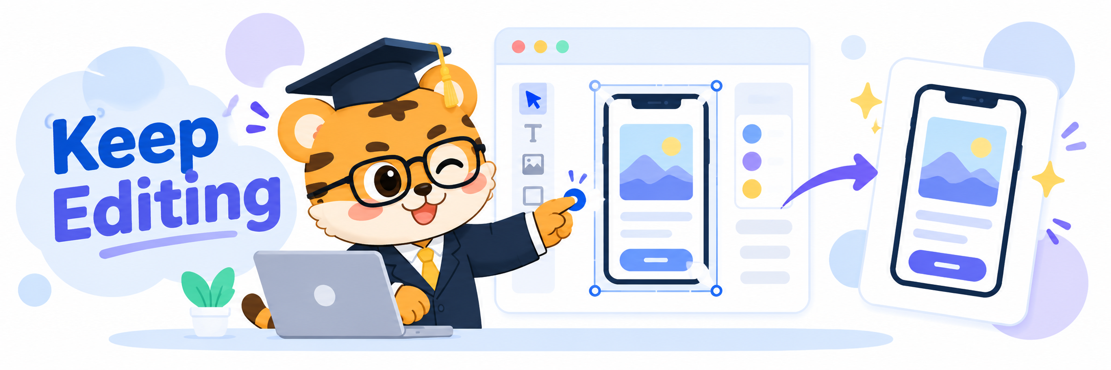
AppScreenshoot gives that process a friendly home. You can reopen an editable project, choose from polished templates or a fresh canvas, replace a product screen, revise the caption, position the device treatment, and review the complete gallery before preparing the final files. It is a clear rhythm for launches, updates, and all the useful little moments in between.
The browser-based workflow has a nice human benefit too. Screenshot decisions often happen in the middle of a conversation. A designer notices a sharper visual contrast. A founder finds a cleaner promise. A developer sends over a screen that suddenly makes the product easier to understand. When the mockup workspace is ready in the browser, the good idea can become visible while everybody still remembers why it felt right.
That is a lovely way to work. The design does not have to wait for a particular machine, a maze of old exports, or a special round of reconstruction. It remains a living expression of the product.
The final step should feel satisfying as well. Once the story is clear, a store-ready image set needs to move cleanly into the rest of the launch. AppScreenshoot brings practical exports alongside the editing flow, so the gallery can go from a connected creative project to individual images without losing the care that got it there.
For anyone choosing an App Store screenshot mockup tool, that is the combination I would look for. Real app screens that stay central. A gallery that can hold one visual idea. An editable workspace that is pleasant to revisit when the app earns a better introduction.
The folder can still be called screenshots-final-final-really if it makes the team smile. But when the work lives in AppScreenshoot, that folder does not have to be where a good story becomes hard to touch. Start your next gallery in the AppScreenshoot editor, and give the product a mockup that helps people meet what it can really do.