
App Store Screenshot Templates That Still Feel Like Your App
Learn how to choose App Store screenshot templates that protect your brand, fit real product screens, and keep launch updates simple.
There is a very particular kind of launch panic that begins with a folder called final final screenshots. Inside are six exports, a few almost identical versions, and one beautiful template that nobody wants to touch because nobody is quite sure what will break.
The product has changed since the first mockups. The team has a sharper opening message. A new screen now explains the app better than the one that made it into the original set. Yet the gallery is frozen, because the path from a good idea to a new screenshot feels weirdly expensive.
That is usually the real question behind a search for App Store screenshot templates. People are not asking for a pretty frame in isolation. They want a useful starting point that makes the work faster without making every app look like it came from the same drawer.
I think the right template feels less like borrowed clothes and more like a well designed room. It already knows where the light should go. You still bring the furniture, the color, and the little details that make someone recognize the space as yours.
That is the appeal of AppScreenshoot. It gives a launch team editable template directions, a browser based editor, and a place for the actual product screens to lead. You can start from an idea that already has visual rhythm, then shape the layout around the app people will install.
The useful test is simple. A template should make three things easier. It should help a visitor understand the product quickly. It should keep the gallery feeling like one story. It should leave enough room for the product to keep changing after the design feels finished.
01 Start with a template that leaves room for your app

The first thing people notice in a template library is usually the decoration. There is a bright gradient, a cinematic device frame, a clever card stack, perhaps a little floating icon situation that looks great in a thumbnail. I get it. A good visual hook is fun.
But the real question arrives one minute later, when you drop in your own screen. Does the layout give your product enough room to be understood, or does the interface become a prop inside somebody else’s poster.
That distinction is bigger than it sounds. An App Store visitor has not sat through your demo. They do not know why that calendar view matters or why the quiet little toggle near the bottom solves a real annoyance. The screenshot has to carry the proof, while the surrounding design points their attention toward it.
For that reason, I would choose templates that put the screen in a generous, readable position. The headline should have a clear home. The background should support the product palette rather than compete with it. A device frame is useful when it clarifies the context, not when it hides the interface under a fashionable reflection.
Try a small exercise before committing to a visual direction. Place one real product screen inside it, then shrink the canvas until the screen feels more like a store preview. Can you still tell what task the app helps with. Can you see the primary interaction. Does the headline make the same promise that the screen is ready to prove.
When those three elements agree, the template is doing its job.
Imagine a travel planner. The most useful screenshot may be an itinerary with flights, stays, and a calm day by day plan. A spacious layout lets the visitor see the trip taking shape. A headline such as Every plan in one place gives the eye a way in. A giant decorative map that covers the itinerary may look lively, but it gives the actual product less chance to speak.
This is why flexible layouts are worth more than a huge catalogue of locked mockups. You want to move the copy when a phrase needs air. You want to resize the device when a dense screen needs to be readable. You want to adjust the background when the product already has a strong personality of its own.
The AppScreenshoot template library is useful here because a template can be an editable composition rather than a final image. Pick a direction that matches the energy of the app, add the real screens, then tune the hierarchy until it feels natural. The visual system gives you a head start, but the app remains the main character.
There is a nice team benefit too. When the interface is visible and the layout is easy to adjust, product people can point at a real moment instead of describing it from memory. A marketer can shorten the promise. A designer can protect the spacing. The conversation stays close to the thing a visitor will actually see.
That is a much better use for a template. Not a shortcut around taste, but a shared surface where taste can become a clear decision.
02 Choose a system that can hold the whole gallery together
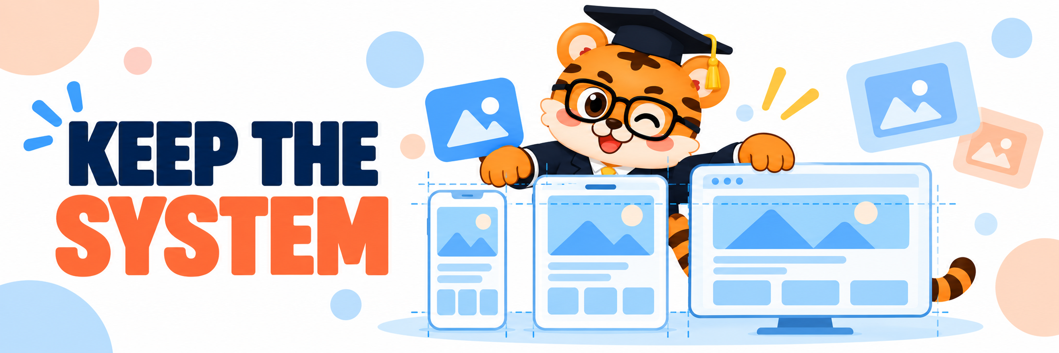
The second thing I look for is consistency, and not the boring kind where every slide repeats the same layout with a different screenshot stuffed inside. A good gallery has continuity and movement at the same time.
One screenshot earns attention. The next one makes the central action feel tangible. Another can reveal the detail that makes the product easier to trust or more satisfying to use. By the final frame, a visitor should feel they met the app, not that they watched the same marketing sentence change clothes five times.
Templates help when they provide a small visual vocabulary that can repeat without becoming mechanical. Maybe every slide uses the same headline area, device treatment, and family of backgrounds. Then the screen placement can shift to match the job of each image. A visual first product can give the interface most of the canvas. A complex workflow can use more structure around a caption and callout.
The gallery becomes easier to read because it is teaching the visitor how to look at it. They recognize the typography. They recognize the rhythm. Their attention can move to the new idea in each frame instead of decoding a brand new design system every time.
I have seen teams miss this by treating the screenshot set as six individual social posts. One slide uses a big photo. The next is dark and minimal. The third has a tiny headline in a new font. Each frame might look perfectly respectable by itself. Together, they create a small trust problem. The listing feels assembled instead of intentional.
You can catch that problem early by viewing the slides in a row before doing final polish. Hide the captions for a moment. Does the product journey still have a shape. Then read only the captions. Do they move from an outcome, to an action, to a reason the app belongs in somebody’s day. If two frames make the same claim, one of them is probably waiting for a better role.
Take a language learning app. The first image can show a daily practice moment and promise Keep learning in motion. The second can show a lesson adapting to a person’s pace. The third can reveal progress that makes the small habit feel worth returning to. Same visual system, different reason to continue.
Templates make that review calmer when all of the scenes live in one workspace. In the AppScreenshoot editor, you can compare the sequence while it is still editable, duplicate a useful direction, and give a later frame a fresh job before the gallery turns into a pile of exports.
This is also where device sizes stop being a nuisance and become part of the system. A strong template has enough structure that the visual identity survives a different canvas, while enough flexibility that type does not get crowded and screens do not become tiny. Consistency should protect the story, not force every composition into one pose.
When the underlying system is solid, the product gets to change focus from one screenshot to the next without losing the thread. That is the balance worth chasing. Familiar enough to feel like one app. Varied enough to make the next swipe feel worthwhile.
03 Keep the source editable so good launch ideas can arrive late
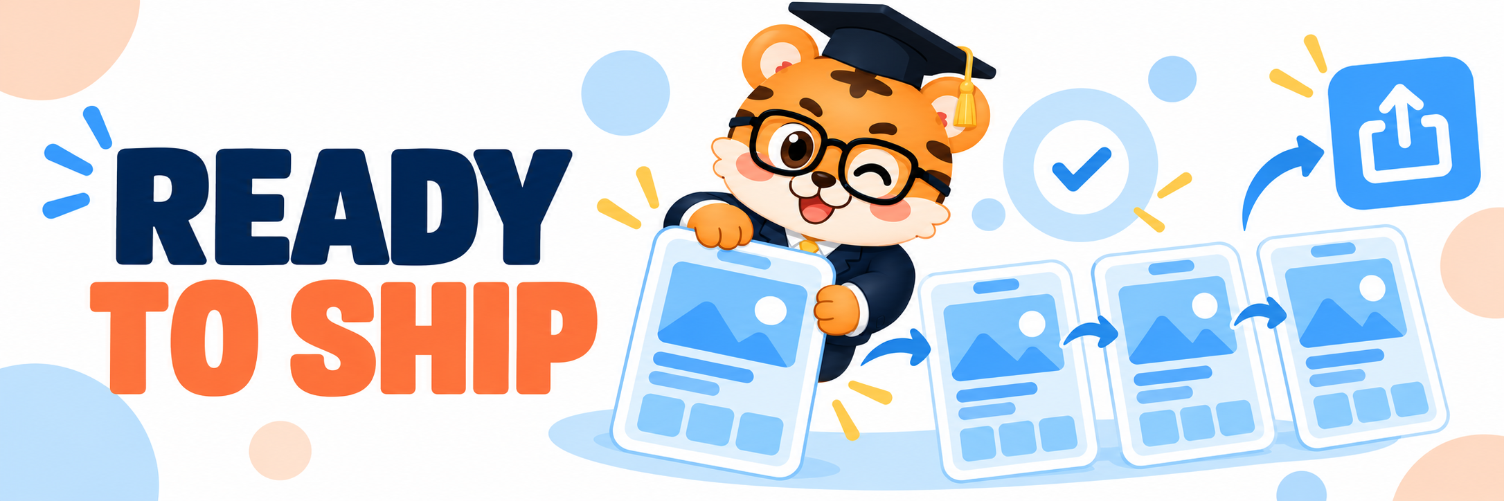
Then there is the part that no template preview can fully sell you, revision.
Launch work has a habit of producing the best idea near the end. Someone tries the newest build and notices a screen that explains the value in two seconds. The onboarding changes and the old caption suddenly feels too broad. A feature lands earlier in the release than everyone expected. The gallery needs to catch up.
This is normal. It is not evidence that the team failed to plan.
The important thing is whether the screenshot template turns that discovery into an enjoyable update or a day of digging through old files. A useful setup lets you replace a screen, adjust the message, and keep the visual rules that already work. You should not have to rebuild every card because one product decision got better.
That is why editable source matters so much. It lets a team preserve the choices that are doing useful work, the type scale, the frame style, the spacing, the calm relationship between product and background, while updating the piece that actually needs attention.
There is a creative upside too. When revision is easy, people make braver decisions. They can test a more direct first headline. They can bring a stronger visual moment forward. They can see whether a quieter background finally lets a dense product screen breathe. The goal is not endless fiddling. It is having enough freedom to notice the better version when it appears.
With AppScreenshoot, that process can stay inside the same editable project. Start with a template, place your product screens, and keep the gallery ready for the next version rather than treating export as a door that closes behind you. It is a simple workflow, but it changes the emotional temperature of launch week.
There is also a compounding effect. The first release teaches the team which screens make a promise land. The next release begins with stronger instincts about the opening image, the copy that earns its space, and the details visitors actually need to see. A living source file keeps that learning close instead of burying it in a folder of old PNGs.
I would keep the handoff deliberately small. Choose a handful of template rules you want to reuse. Keep the headline treatment recognizable. Give each screen a distinct job. Then leave every scene editable until the story feels like the current product, not the version of it people were excited about three weeks ago.
That first folder called final final screenshots does not have to be the end of the story. It can be the beginning of a launch system that gets easier every time the app gets better.
Start the next gallery with AppScreenshoot, and use an App Store screenshot template as a confident starting point for the app only you can make.